
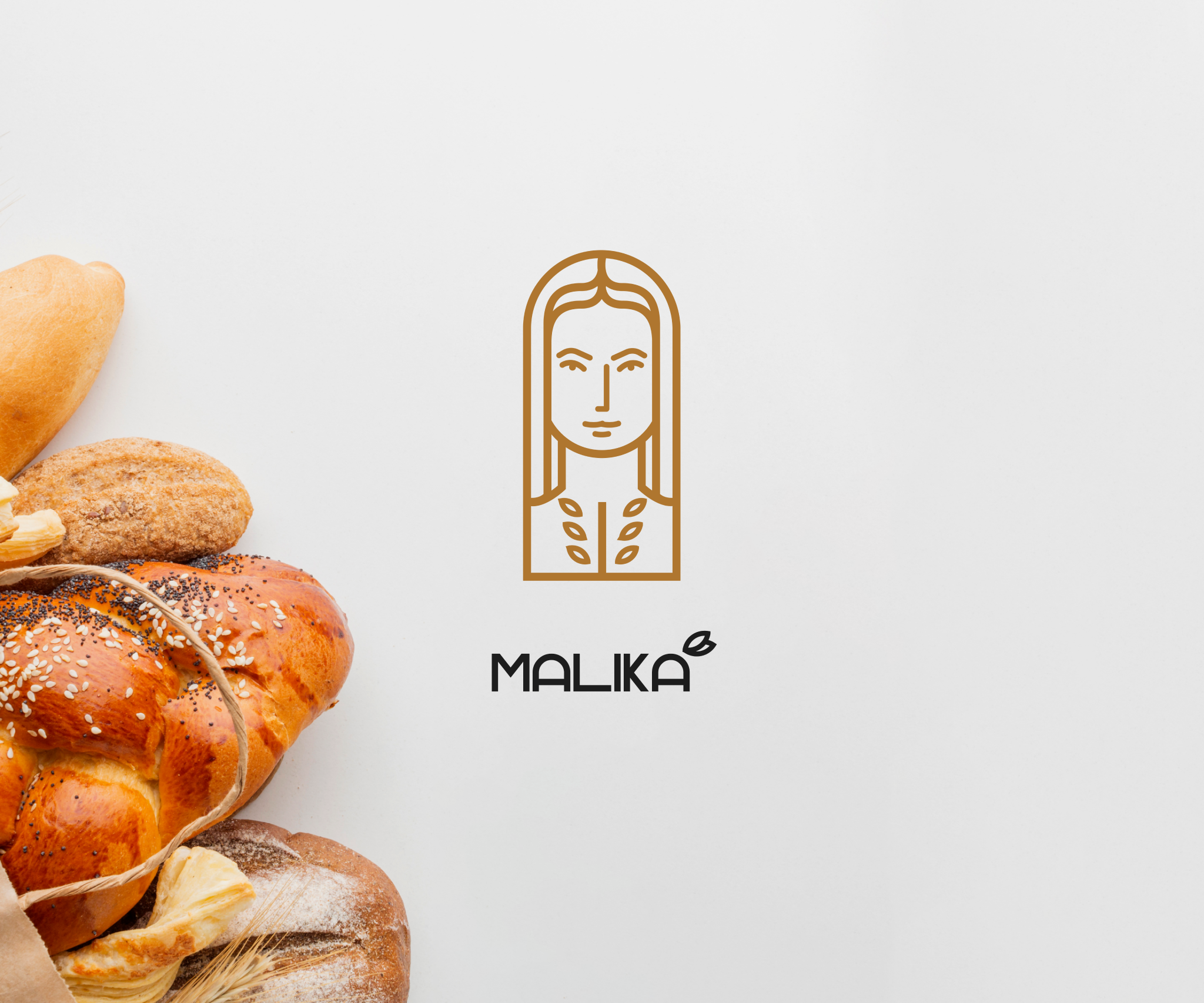
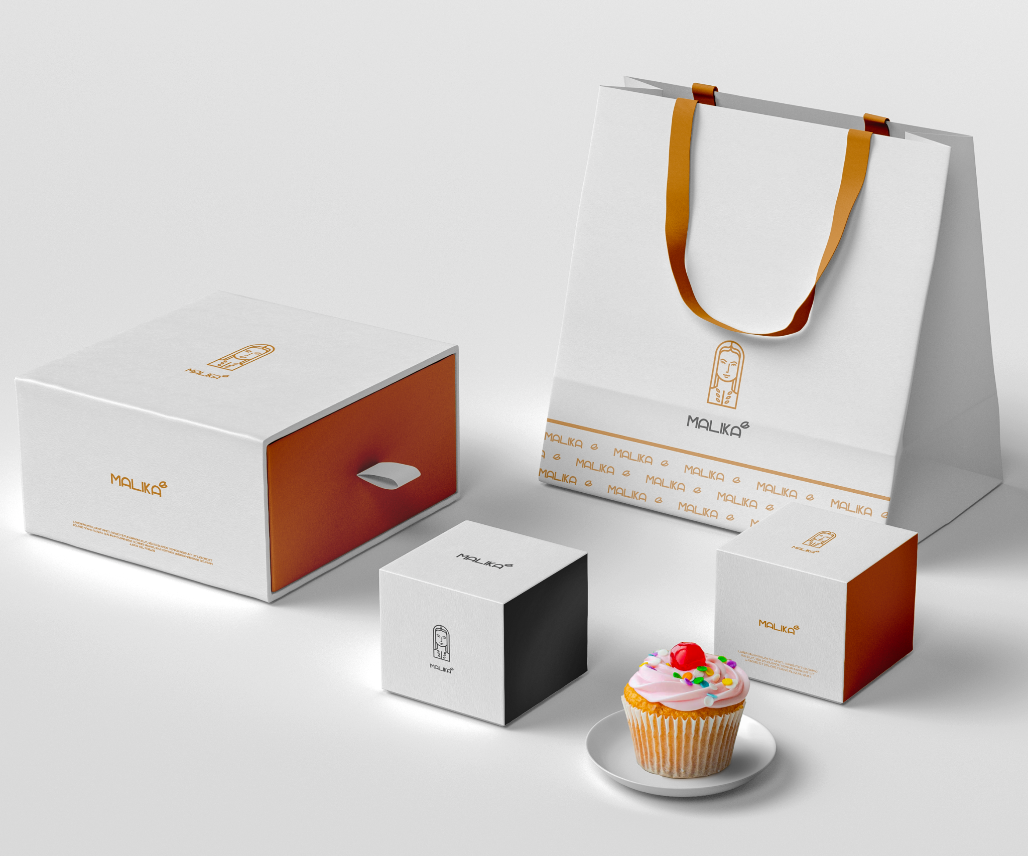
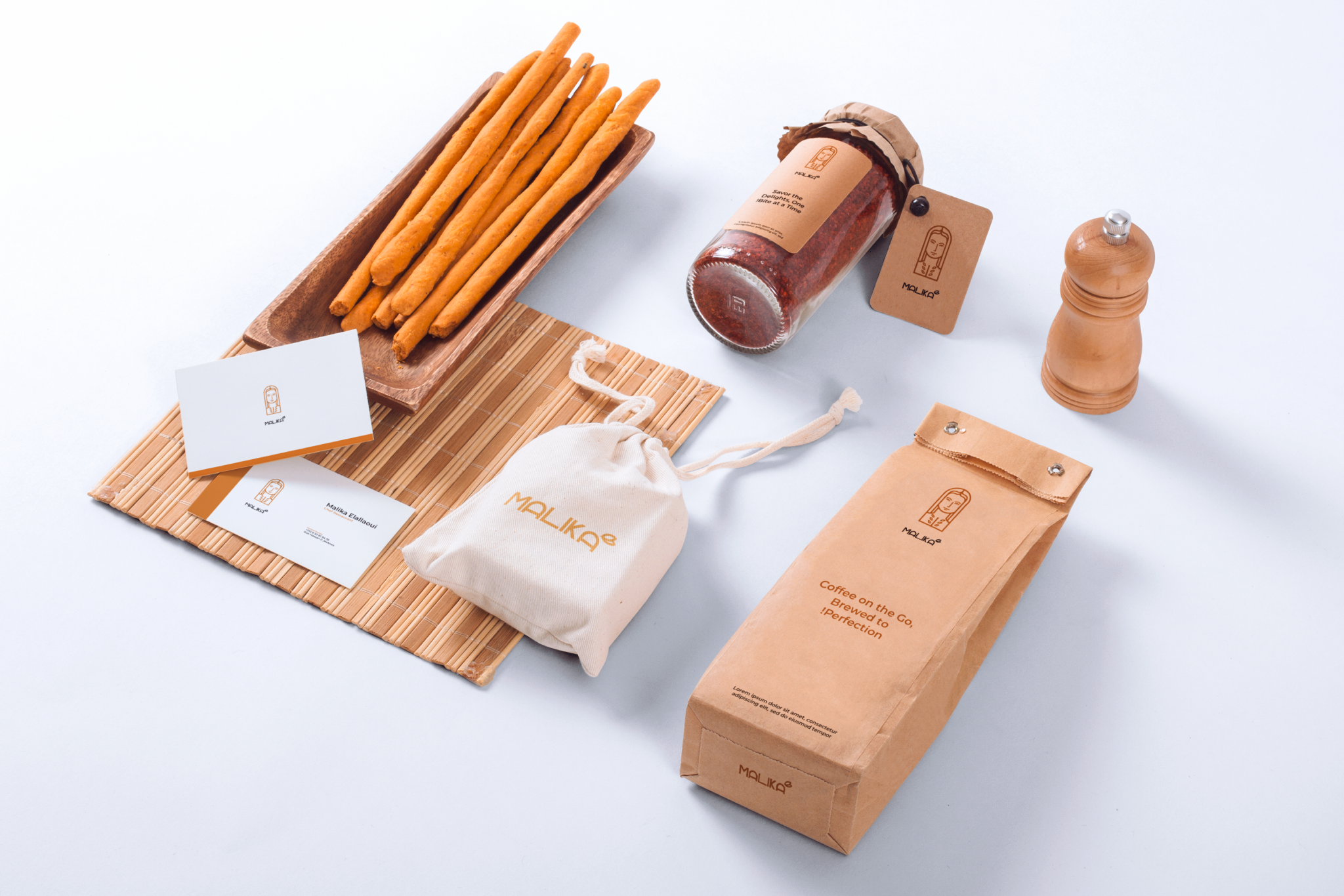
Malika Bakery Brand Identity
The logo for Malika Bakery showcases a captivating illustration of a woman, representing the bakery’s essence and brand identity. The design exudes elegance, sophistication, and a touch of femininity, perfectly embodying the spirit of Malika.
The central focus of the logo is the beautifully rendered drawing of a woman. She is depicted in a graceful and confident posture, evoking a sense of professionalism and expertise. The woman’s attire reflects a blend of traditional and modern elements, symbolizing the bakery’s commitment to both time-honored baking techniques and contemporary flavors.
The typography in the logo complements the drawing of the woman. A refined and elegant font is used to spell out the name “Malika” below or beside the illustration, adding a touch of sophistication and professionalism. The font choice aligns with the overall design aesthetic, creating a harmonious and visually appealing logo.
The Malika Bakery logo, with its captivating drawing of a woman, effortlessly communicates the bakery’s dedication to creating exquisite baked goods and providing an elevated baking experience. It serves as an enticing invitation for customers to savor the delights that Malika Bakery has to offer.

1 Comment
You
Beats